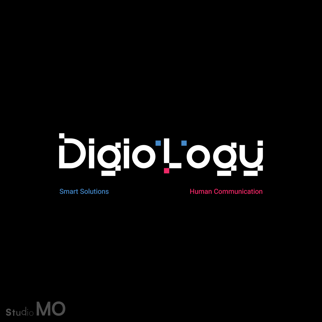
Digiology explores the space where digital intelligence meets human interaction.
As a digital solutions studio, Digiology helps brands navigate the digital world through strategy, technology, and meaningful experiences. The challenge was to create an identity that could represent both sides of the brand — the precision of digital systems and the human connection behind them.
The visual identity is built around a simple idea: technology becomes meaningful when it connects with people.
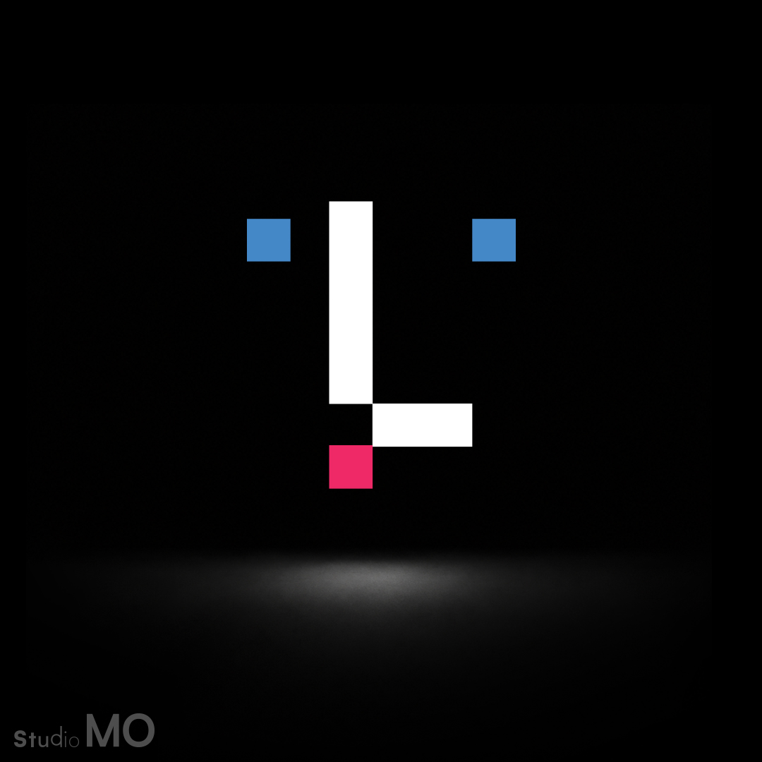
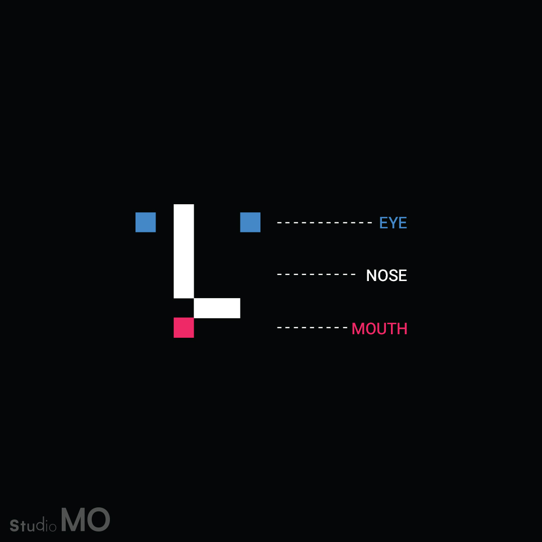
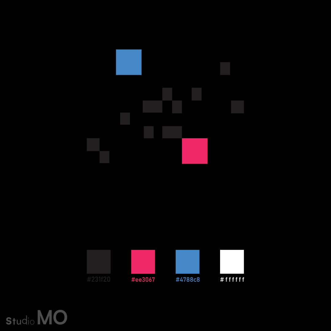
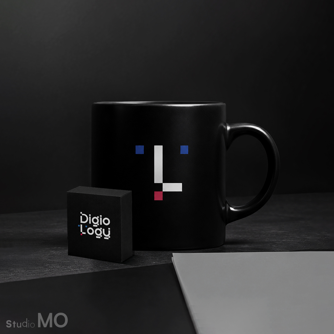
The symbol transforms geometric elements into a minimal human expression. Two blue squares represent awareness and intelligence, while the pink accent introduces emotion and personality. Together, these elements create a visual language that reflects Digiology’s approach: smart thinking with a human perspective.
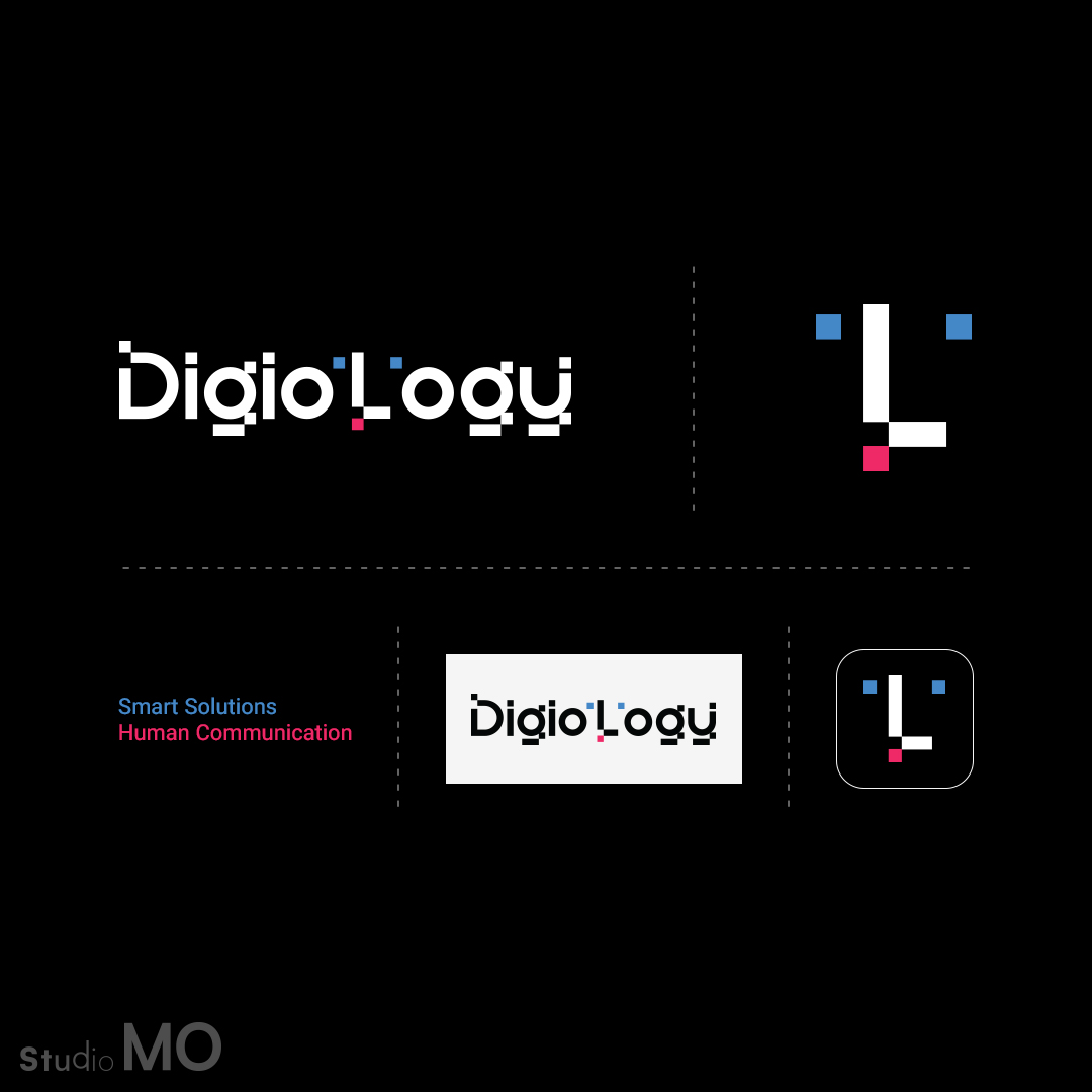
Beyond the logo, the identity expands into a flexible visual system based on modular shapes, pixel-inspired elements, and a distinctive color palette — designed to adapt across digital platforms and brand experiences.
Digiology’s identity is a balance between logic and emotion, systems and people, digital precision and human connection.